Your site is ranking, now let’s make it pretty!

your-site-is-ranking-now-lets-make-it-pretty

As a internet marketing company, it’s our main goal to help companies rank their websites higher in the SERPs.  That’s what we’re good at and that’s what we do.  But it’s my job as a designer to make the pages look good; an equally important proposition.  A well designed page gives your company and your product more credibility.  If your website is ranking high and features a great product yet looks like it was made in the late 90s by a neighborhood kid, chances are todays web consumer won’t be thrilled.

So with that in mind, and this being my first blog post in the holiday season, I have decided to share with all the readers of this blog some helpful tools and tricks to make your site look better.
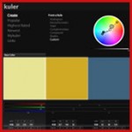
Color1) Color scheme.  This is one of the most important things to focus on for the design of your site.  Granted, many sites are colored based on the corporate color scheme, but there are always ways to to spruce it up with complementary and secondary colors.  My go to tool for finding color schemes is the fantastic Color Scheme Designer by Petr Stanicek.  This is a great tool where you can enter a color hex code and automatically generate a color scheme.  Another great tool is Adobe Kuler, a newish tool that I feel I have yet to even scratch the surface of.

Web Standards2) Standards.  If web 2.0 was centered around rounded corners and shiny buttons (I’m sort of kidding), then web 3.0 will surely be about standards.  It’s no longer only important that your page looks good, it has to be coded correctly as well.  And this isn’t just to satisfy people that care about code.  Properly coded web pages save bandwidth, function (for the most part) well in multiple browsers, and are easier to have function in mobile browsers.  The best resource for standards web design and development is A List Apart by Jeffrey Zeldman.  His new edition of “Designing with Web Standards” was released a few weeks ago and is an extremely helpful book.

Firebug3) Firebug. Want to see what that form would look like just a smmmmidge to the right? Want to know why that image is overlapping your text.  Firebug is the thing to get!  Firebug is a free plug in for Firefox (you are using firefox aren’t you?) and allows you to edit elements of your css code in real time without actually changing any of the code.  If you don’t have it…get it! A necessary plug in.


Fonts4) Fonts. As anyone who has developed websites will tell you, the variety of fonts you can choose from on the web is very limited.  Do you want Arial or Georgia?  Yeah.  That was a problem I have run into for a long time and have finally found a solution.  It’s called “Cufon” and allows you to upload a font that is then converted to a javascript file and is placed in the header of your website.  Then it replaces text in various css tags to be displayed in that font.  It is very cool and does not change your css coding of words inside tags.  You can check it out here… http://cufon.shoqolate.com/generate/.

Well there are some little tips and tricks to use to spruce up your website.  I hope you found them useful and your website has a happy holiday season.  If you have any suggestions or questions, the comment area below is a good place to put them.

3 Comments

Viral Marketing… did Microsoft trick us?!

viral-marketing-did-microsoft-trick-us

In the spirit of Halloween, I would like to take this time to talk about a potential trick that was pulled on all of us recently.

As anyone in the internet world will tell you, it is difficult to make something ‘viral’ in today’s online media world. The one thing required to make something viral is that it needs to be something that, when viewed, inspires the viewer to pass it along to everyone they know, invite people around their desk to watch it, or tweet/retweet it.

And that’s not an easy task.

Today’s savvy internet user is fairly unshockable.  There is little you can do (and keep it PG-rated) that will create ANY kind of shock, interest, or humor.  That makes it relatively hard for a big company like Microsoft (who already has a perceived image) to create a promotional campaign/video.  What can they possibly do, then?

Let’s fast forward to right before the launch of Microsoft’s newest OS, Windows 7.  They of course needed to market it after the dismal Windows Vista release, so they decided on a (let’s sarcastically say) brilliant ad campaign where users would host Windows 7 launch parties.

Essentially, a person could decide that they liked Windows enough that they would go online, sign tons of paperwork and become an official launch party host.  They could then recruit all their friends to come (using an overly complicated invitation system that discouraged people from actually using the official way) and sit around and… install Windows 7.

But that’s not all.  If you had enough people you could potentially get a Windows 7 box signed by Steve Ballmer.  Don’t even check eBay, because I’m sure no one would want to part with that gem.

I realize that I may not be explaining this process very clearly. So Microsoft, in their eternal wisdom, made a video that explains the whole process.  Please enjoy below.

Now… I’m going to assume you watched it and that you have the sensibilities and intelligence of a moderately intelligent human being.  What the heck was that?!?!  Awful, awful, awful.  I mean really… it’s embarrassing.  On every single front.  Acting, video, writing, sound quality… was this really produced by a multi billion dollar company?Why, this video is so BAD that I am inspired to forward it to all my friends and laugh at it…

Oh wait.  They got me.  Now, I’m not a conspiracy theorist, but this one has to make you wonder. Did Microsoft intentionally make one of the worst, lamest, milquetoast videos to play right into the lame-o image that Apple created for them?  My gut says no, they aren’t that smart.  But at the same time, it makes me wonder.

If the goal of the video was exposure and publicity, it worked.  The video has been viewed millions of times.  It has been laughed at and mocked, it has been spoofed and goofed.  It’s an embarrassment.  Again, I don’t think they meant to, but Microsoft made one of the most talked about viral videos of the year by making themselves the brunt of the joke.  Congrats.  They did it.

But at what cost?

0 Comments

Designing Above the Fold…Does It Matter?

designing-above-the-folddoes-it-matter

Old NewspapersIf there’s one thing that most designers will tell you is important when designing a page, it’s that all of the important content should be “above the fold.”  It’s a common practice that dates back to when humans read something called “newspapers.”

These archaic gray monstrosities were often printed on thin paper and folded right in the middle.  Therefore, it was standard practice to put the most important content “above the fold.”

The difficult thing about designing above the fold on the internet is… well, we never know exactly where the fold is!  Nevermind the fact that most people use a variety of screen resolutions, ranging from the dreadful 800 x 600 up to the glorious 2560 x 1600. On top of that, people also can have an unknown variable of toolbars.  Currently, I have 3 toolbars on my 1680 x 1050 monitor, cutting out about 85 pixels from the top of my browser.

So what can a designer do?  Typically, the thought is to design a page for the least common denominator, assuming that your average viewer will be looking at your page on their grandmother’s 13in. CRT display.  This means putting all the stuff you deem as important up at the top and all the rest slapped down at the bottom.  The obvious problem to this is that it will look weird on regular monitors.

So what can you do?

First, you can take a look at your site statistics and figure out what percentage of users are looking at your page with various resolutions. If no one is looking at your site at 800 x 600, don’t worry about designing for them!

Second, you can determine which parts you absolutely want above the fold, like a call-to-action form, and place that higher up on the page. Then you don’t have to worry about whether or not you have an H1 and an H2 above the fold.

Third, and most importantly, you can ignore the problem altogether and read this interesting article about whether or not “designing above the fold” is worth the effort. The article comes with heatmaps and actual user testing.

Read this article…it’s worth your time.

I highly suggest reading this article and making your own opinion.  The most important thing that I took away from it is that your site should have enough important, relevant content on the page that makes me actually want to scroll down the page.

Imagine that?  People will scroll down the page if there’s interesting content!

It sounds so simple, but I think it’s a concept that most people forget.  If you have interesting and relevant content on your page - information that people are actually looking for - it won’t be a chore for them to read it.

Then, your content will be digested by more people and visitors to your site will stay longer, improving your bounce rate. That will help the overall ranking of your site.

So as a designer, this is an exciting revelation. Great content makes or breaks a page, not the designer!  Well, I’m off to forward this article to our copywriter.  The burden is all on you from now on, Ashley!  Guess I’m off to lunch now.

0 Comments

Seo Explained by the Poetic Prophet…

seo-explained-by-the-poetic-prophet

As ProspectMX’s resident designer, knowing all of the nitty gritty details of SEO can sometimes be over my head.  So what do we have here?  Why, it’s only the Poetic Prophet (aka the SEO rapper) here to explain SEO to me in with…..rhymes and funky beats?  Ok, I admit I’m not a huge fan of rap music, but this is just awesome.

My favorite verse is..

“your photoshop functions then slice that design
do your layout with divs make sure that it’s aligned
please don’t use tables even though they work fine
when it come to indexing they give searches a hard time”

0 Comments

How much is your frustration worth? Amazon.com knows!

how-much-is-your-frustration-worth-amazon-com-knows

The topic of this blog is putting a pricetag on frustration…and speaking of frustration, I’m preparing a sure to be hilarious recap of web usability problems with TNT.com. (Note to TNT- fire all of your web people.)

In the meantime, I found something online that I felt was very interesting.  Tonight I was searching for a ‘Microsoft Wireless Mouse’ on Amazon and came across something I had never heard of before.  Look at these 2 Amazon links and tell me if you can spot the difference.

Link1

Link 2

Could you spot the difference? Congratulations!  It’s not like it was right in the product headline or anything.  For those that missed it, Amazon is selling the EXACT SAME mouse for about 4 dollars more because it is in, what they call, “Amazon Frustration-Free™ Packaging”.

I hate dealing with those plastic death traps they put around gadgets as much as anyone else, but is it worth a $4 bump in price? What would I be willing to pay in any given situation to get the same thing with less frustration? $10 more for shoes you don’t have to tie (oh wait, that’s why I wear velcro). $100 more for a computer that never crashes? I’d pay it (and as I type this on my iMac I realize I did exactly that…except, more than a hundred dollars extra…).

My overspending aside, the point is, your lack of frustration is worth something. It’s just hard to figure out exactly how much it’s worth. In any given situation when you buy something, I wonder how much extra you would pay for better service, a better experience, an easier delivery method, etc.  How much money are companies losing because they aren’t willing to add that little touch to make their extra service worthwhile and “frustration-free”?

But this is starting to get deep.  In this case, for $4 extra dollars, I’d rather buy a sweet pair of scissors and just go to town on that plastic packaging.

Because in the end, I’d then have a wireless mouse and a cool pair of scissors to do with as I pleased. Win-win.

0 Comments